Common List
The common list user interface pattern is the most frequent pattern used to display a paginated collection of ‘Things’, with related actions which can manipulate that collection.
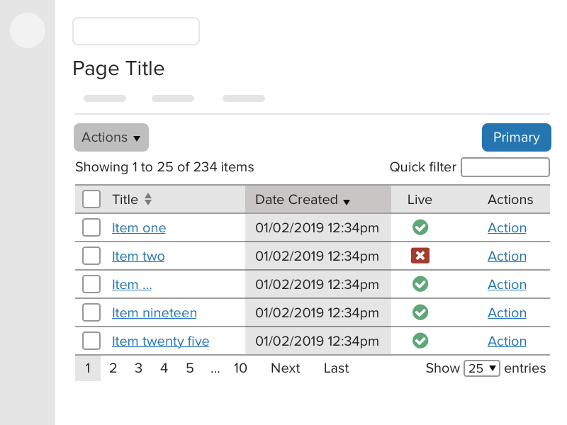
Titles
HTML title
The title attribute is a an essential piece of information, especially for assisitive technology users and should be short, relevant to the data being listed, descriptive and make use of variables where necessary.
Use the pipe character | to separate the heirarchy of information. The account or organisation name should be included to help the user discern between multi-tenanted systems like CXM, or Galaxies Sites.
Examples
<title>My Documents | {{ account name }}</title>
<title>{{ person_name }} | {{ cases }} | {{ account_name }}</title>
<title>No results found for {{ search_term }} | {{ account_name }}</title>
Page title
The page title should describe the Things being listed by the UI. For example. Documents, Cases, Forms. This can be contextual depending on what is being displayed, such as All Cases, My Cases, Closed Cases etc...
Actions bar
The actions bar appears below the tabbed navigation and consists of the actions menu, and one or more action buttons. The specific markup required for the actions bar is documented in the actions bar pattern.
Actions menu
The actions menu is a dropdown button which contains a list of actions which can be performed on the Things listed in this user interface. Usually it will contain the primary action, as well those actions which may be performed on items in the list which have been selected using the row selection checkboxes.
If an action is dangerous or destructive, such as Delete, you should use the link--danger class to illustrate this.
The primary action should always appear at the top of the menu, and the delete action at the bottom separated with a divider.
Actions menu items should be sentence case.
If an action cannot be performed unless one or more items are selected, the link should be disabled.
Primary actions button
The primary action is located towards the top right of the user interface and is typically an html.button element with the .btn--primary class which, when pressed, will perform a form submit or a save action, allowing people to save their changes.
The actual interaction which will occur when this action is triggered may vary depending on the needs and complexity of the user interface. For example, it may present the user with a full 'common form' or a modal.
There are some situations where it is not appropriate to place a primary action in the UI, such as when the common list is used to display Things which are not possible to be explicitly created by the user (like a history log or audit trail). This is the only time where the button can be completely absent.
Disabled action buttons
If the user does not have the necessary permissions to perform the primary action, the button should be displayed in a disabled state.
Multiple action buttons
Ideally a user interface should focus on the singular main task you want that user to perform, however there may be times where more than one action needs to be presented to the user, you should use your own judgement about how to present these and try not to overload the user with choices.
Example of a primary action, and a less important secondary action:
Example of a choice:
Example of more than one equally important actions:
The DataTable
The common list pattern's main UI element is a datatable which presents the user with a list of Things, usually organised in date order (newest first) with up to 25 items per page as the default view. The table will show extra critical information which is requried depending on the context of the content. This may include dates, statuses or a collection of actions that can be performed on the items.
The number of entries on each page of the table can be controlled by the dropdown option in the DataTable footer, the value of this should be stored by the Jadu product as a persistent user preference.
| Row selection controls | Title | Owner | Modified | Live | Visible | Actions |
|---|---|---|---|---|---|---|
| The Terminator | James Cameron | 01/07/1991 12:34 | Queue Play | |||
| Conan the Barbarian | John Millius | 02/04/1982 12:34 | Queue Play | |||
| Predator | John McTiernan | 01/01/1988 12:34 | Queue Play | |||
| Commando | Mark L. Lester | 21/02/1986 12:34 | Queue Play | |||
| Terminator Genisys | Alan Taylor | 25/06/2015 12:34 | Queue Play |
Caption
Use the caption element if using raw markup or the caption helper option to describe a table in the same way you would use a heading. A caption helps users find, navigate and understand tables. You can hide the visually hide the caption while keeping it accessible and visible to screen readers by adding the hide class (the datatable helper will automatically add this for you).
Column headers should be short yet descriptive, and use as few words as possible to describe what is contained in their respective columns. For example, it’s not required to use 'Date Created' when simply 'Created', and the fact that the column contains date information is enough information.
Columns
The first column, containing the primary 'Thing' reference, should link to the UI which controls that specific Thing. Usually an edit view, but may be some other form of detailed display.
Table column header labels should be consistent with others within the same product. Avoid mixing terms or contractions like Case Ref, Case Reference and Case ID.
Column headers should be sentence case.
Columns should be orderable, unless there's no need to order a column to organise data (such as the 'actions' column).
DataTables will automatically make columns orderable however that behaviour can be disabled, some additional information is required to make date/time columns orderable. You can refer to the DataTable documentation for more information.
Examples:
- Primary 'Thing' reference (e.g. Name, Title, Case Reference or Form)
- Created
- Modified
- Status
- Owner
- Actions
When deciding between 'Name' or 'Title' for the main column, if the Thing has a title field (like a Document) you would use 'Title', however if the Thing has a name (like a Location), then you may wish to use Name.
If you have different pieces of data that refer to the same Thing, you don't have to redeclare what the Thing is in each column, especially if the page title describes the Things. Instead of using Form Name | Form ID | Form Status you should simply use Name | ID | Status if the page title is "Forms" or similar.
Initial column order
It is possible to define which column is used to order the table on the initial page load. Typically it is most appropriate to sort by the date created/added in descending order so that the content is ordered by newest first.
Refer to the DataTable set initial column order documentation for specific information on how to define the column sort.
Row selection checkboxes
It is strongly recommended that the user is able to perform actions on more than one row item at once, the most basic use of this would be to delete multiple items at once however you may want to allow other bulk actions such as publishing content, applying categories or changing the status of an item.
If no bulk actions are provided by the user interface, the row selection column can be hidden by supplying the data-select="false" option to the DataTable.
Status icons
If a column needs to display the status of a boolean value, such as whether an item is live/offline, or visible/invisible, you can use status icons to display this information.
Status icons must contain appropriate accessible labels so their meaning can be discerned when viewed without the context of the table header.
Actions column
Depending on the needs of your user interface, it may be useful to surface some actions to the top level list view so that they can be quickly triggered without the user having to navigate into a specific list item to perform the action.
The actions column is not a replacement for the actions menu and you should be aware of the difference in context. The actions menu is a multi-step process to affect one or more Things in the table (select the rows, open the actions menu, choose the action) where as the actions column allows the user to trigger an action on a single Thing with one click.
The actions column will contain multiple links with the same label (e.g. "Archive") which will trigger warnings in accessibility testing tools. To improve the context of these actions you should add a more detailed aria-label which is specific to the Thing being acted upon. e.g. "Archive my awesome report".
Do:
- always use the 'Actions' heading label for this column
- only surface the most important actions that a user may need to perform quickly and often
- use a link if the action navigates away from the page
- Use a button if the action stays on the page (like trigger a task or open a modal)
Do not:
- include a delete action (either in the actions column or as an icon), items should be deletable through the actions menu.
- include this column if there are no actions to display
- Make this column orderable
Pagination
To prevent the common list view from being too large it is necessary to limit the number of results that appear on a given 'page'. The DataTable component will automatically limit the table to 25 rows and paginate the rest, and there are multiple methods of populating the table with data that developers may use. You can refer to the DataTable documentation