Masterswitch
The masterswitch pattern allows you to enable and disable a larger UI with a single control. Commonly used in ‘settings’ interfaces it provides an easy to understand on/off switch for users.
Dependencies
You will need the DisableUiComponent and MasterSwitchComponent included in your browserify configuration.
var DisableUiComponent = require('/path/to/pulsar/DisableUiComponent'),
    MasterSwitchComponent = require('/path/to/pulsar/MasterSwitchComponent');

module.exports = {
  DisableUiComponent,
  MasterSwitchComponent
}
var $html = $('html');

pulsar.disableUi = new pulsar.DisableUIComponent($html);
pulsar.masterSwitch = new pulsar.MasterSwitchComponent($html, pulsar.disableUi);

$(function () {
  pulsar.disableUi.init();
  pulsar.masterSwitch.init();
});
Basic usage
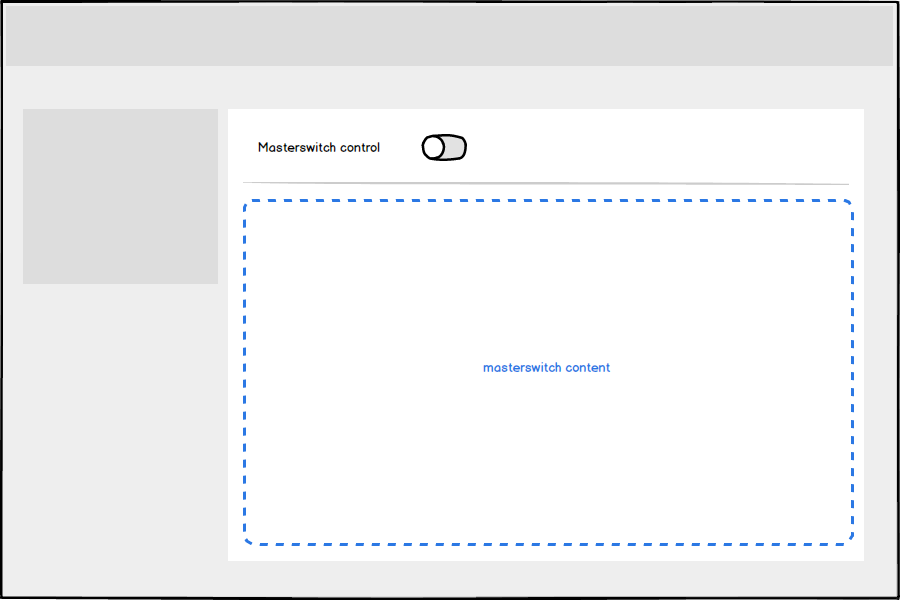
There should only be one masterswitch within a given UI, although there could be multiple masterswitches on different tabs.
<div class="masterswitch">
  {{
    form.toggle_switch({
      'class': 'masterswitch-control',
      'label': 'Your label',
      'id': 'toggletest',
      'name': 'toggletest'
    })
  }}

  <hr />

  <section class="masterswitch-content is-disabled">
    {{ form.create() }}
    {{
      form.text({
        'label': 'An input',
        'id': 'master-input',
        'name': 'master-input'
      })
    }}
    {{
      form.end({
        'actions': [
          form.submit({
            'class': 'btn--primary',
            'label': 'Primary Action'
          }),
          html.button({
            'class': 'btn--naked',
            'type': 'link',
            'label': 'Cancel',
            'href': '/home'
          })
        ]
      })
    }}
  </section>
</div>
Setting initial state
You can tell the UI to be enabled or disabled on page load by setting the checked attribute on the toggle switch. This will affect both the masterswitch control and the masterswitch content.
Load with the masterswitch enabled
{{
  form.toggle_switch({
    'checked': true,
    'class': 'masterswitch-control',
    'label': 'Your label',
    'id': 'toggletest',
    'name': 'toggletest'
  })
}}
Load with the masterswitch disabled
{{
  form.toggle_switch({
    'class': 'masterswitch-control',
    'label': 'Your label',
    'id': 'toggletest',
    'name': 'toggletest'
  })
}}
Switching on
Toggling the masterswitch will enable any interactive elements (like form fields and links) within the related masterswitch content block. The majority of time this will be by the user clicking the masterswitch control.
Switching off
Switching off the masterswitch should immediately disable the relevant settings for the user without the need for a page refresh or clicking a confirmation button.
Any inputs inside the masterswitch-content should not be cleared, it should be possible for a user to restore their original settings by switching the masterswitch back on.
Clickable elements inside masterswitch-content should be disabled when the masterswitch is switched off, a user should not be able to interact with the disabled UI.
There may be situations where you require the user to confirm their choice to switch off a masterswitch, an example is the two-step verification UI where we need to warn the user that this will make their account less secure, and prompts them to re-enter their password and verification code.