Disabled UI
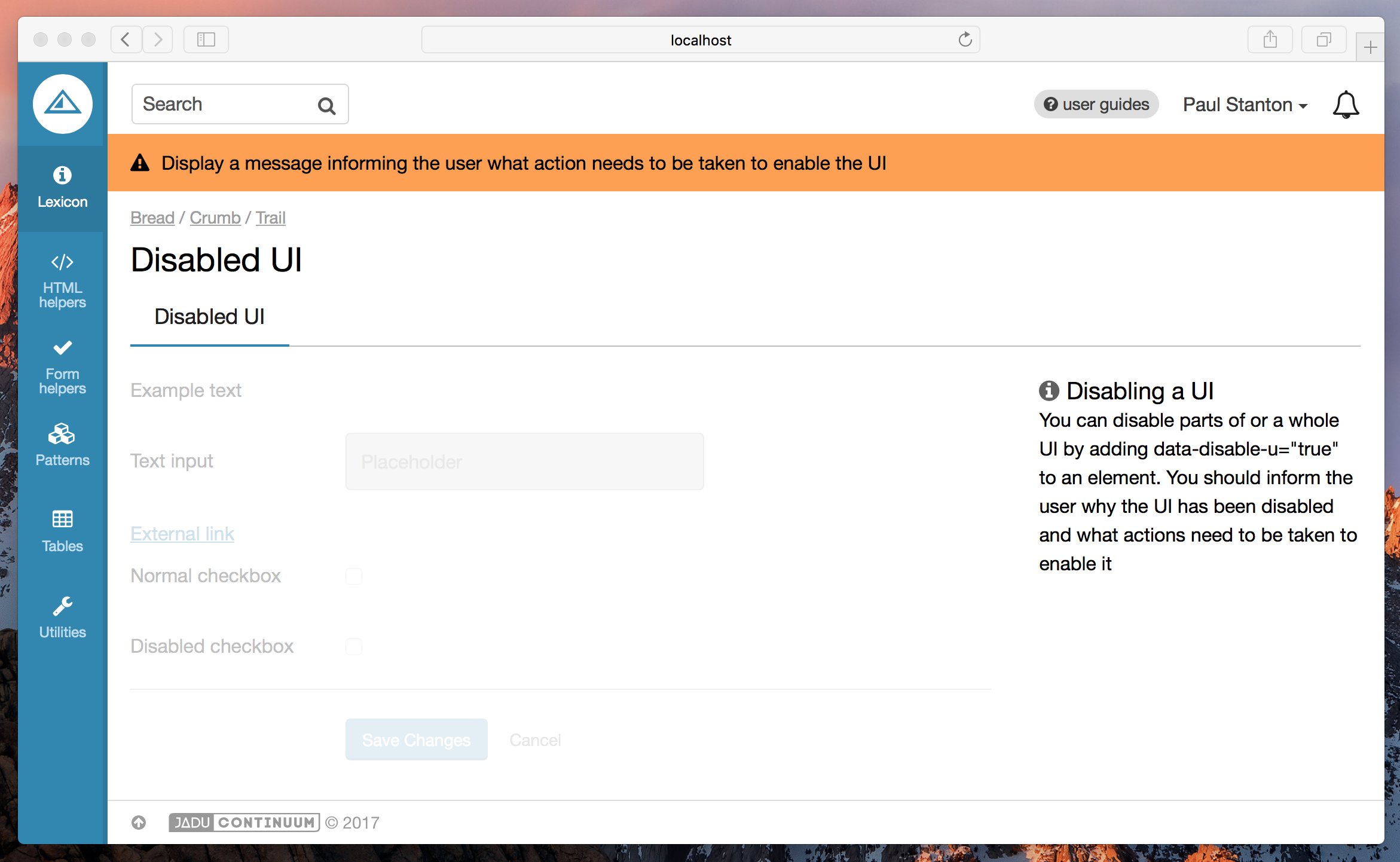
The Disabled UI pattern allows you to prevent the user from interacting with parts of a UI. This can be useful when an external action needs completing before the UI can be used. A message should be shown advising the user what action needs to be taken.
Dependencies
You will need the DisableUiComponent to be included in your browserify configuration.
Depending on your setup, this will probably need to be in be in a file called index.js or main.js.
var DisableUiComponent = require('/path/to/pulsar/DisableUiComponent');

module.exports = {
  DisableUiComponent: DisableUiComponent
}
var $html = $('html');

pulsar.disableUi = new pulsar.DisableUiComponent($html);

$(function () {
  pulsar.disableUi.init();
});
Basic usage
Add data-disable-ui="true" to the element you wish to disable. All child elements will also be disabled.
It is expected that you will write your own code to enable this UI when the correct conditions are met, if you want to disable the UI and present a single 'enable' control to the user, check out the Masterswitch pattern instead.
- Twig
<p>This is outside the containing div and will not be disabled</p>
<div data-disable-ui="true">
  {{ form.create() }}
    {{ form.fieldset_start({'legend': 'Filter by'}) }}

    {{
      form.text({
        'label': 'Text field example',
        'id': 'foo'
      })
    }}

  {{ form.fieldset_end() }}
  {{
    form.end({
      'actions': [
        form.submit({
          'label': 'Save',
          'class': 'btn--primary'
        }),
        html.link({
          'label': 'Cancel',
          'class': 'btn--naked',
        })
      ]
    })
  }}
</div>